
When I joined Odeko as a product designer, my first task was to create a cohesive atomic design system using Figma. This included responsive components, documentation, tokens, and maintaining accessibility standards.
Odeko is a company who provides a product suite that unifies the coffee shop experience. This includes:

I took on the role as Lead Product Designer, and the project duration was one year. The project phases included:

I implemented a research approach that prioritized user groups which ensured their needs were the focal point of our efforts. With the guidance of a senior product designer, my design manager, and an engineering lead, we successfully identified pain points among both designers and developers. This enabled a comprehensive assessment of necessary changes. In summary, this included:
This was my first time doing a complete revamp of a design system as a lead designer. At this point, Figma was swiftly coming out with features such as auto-layout which would be very powerful for design system components. This was especially prevalent due to this design system needing to work for both mobile and web applications.
Realizing this, I educated myself through Figma’s online documentation, YouTube channel, and Config talks to be able to fully understand how to build the most up-to-date design system. This would incorporate new features that Figma added down the line and keep the design system running smoothly.
Collecting user feedback is paramount in UX design, and engaging with actual users significantly enhances the project's overall success and impact. Following the heuristic evaluation, I routinely met with the other designers and developers who would be using the design system components.
These collaborative sessions with team members brought up valuable insights into pain points and desires. This identified the common ground between designers and developers. Presented below are excerpts from the feedback sessions that informed the prioritization strategy for each team:


Stakeholder interviews allow the goal of the project to become married with the business goals for the company.
As the components were being designed, I talked with the design team manager, director of engineering, and director of marketing to ensure that all of our goals were being aligned:
By meeting regularly, we were able to discuss issues before components became solidied within Figma and Storybook. This also allowed for everyone to provide feedback as needed.
After compiling and documenting all my findings, I collaborated with the Director of Engineering and another designer. This led to brainstorming sessions one to two times a week to ensure project alignment. Additionally, I sought insights from other designers to understand the specific components required for their ongoing projects.
To kick off our first component, we decided to focus primarily on the Button component. This would allow us to build a foundational component that used tokens for color, radius, typography, and padding. This would also be the easiest component to start incorporating into live projects.
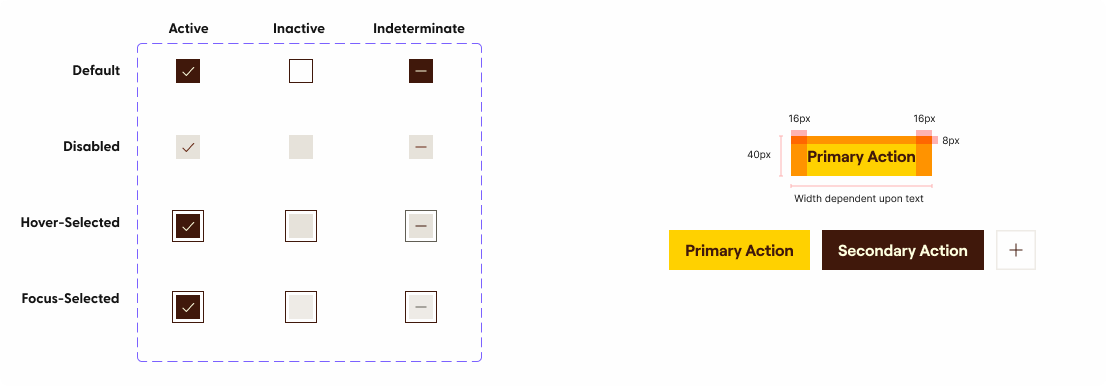
One of the main pain points I found with designers was the lack of being able to search for specific components and finding relevant results. This led to creating a naming structure for all components from table columns all the way to icon categorization. This allowed for variants to be easily found and customized. Below is an example for a primary checkbox with a default active state:
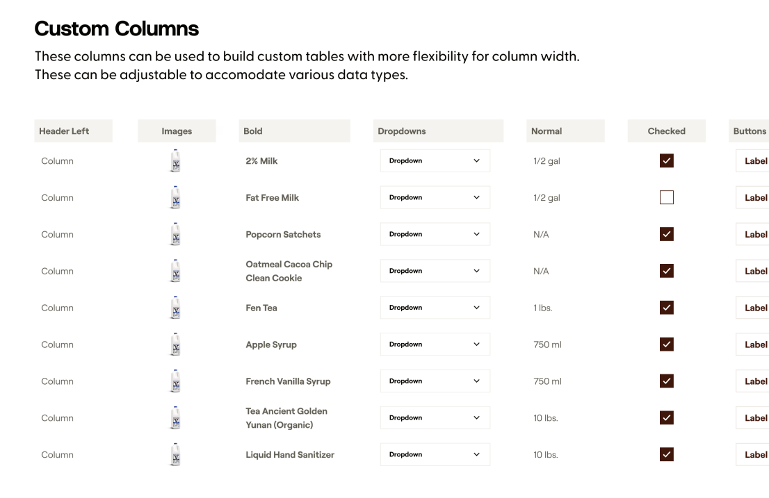
As much as I may want to jump into a project and try to figure out the best way to do something, working with other designers, engineers, and stakeholders allows you to gain perspectives that you may have overlooked. For example, I learned how difficult something such as a table component could be and how to create a flexible, modular solution.
For marketing stakeholders, providing them a way to flip between design system themes so they could efficiently pull product screens was also incredibly important. Lastly, as mentioned earlier, designers needed ways to more effectively search and customize components without misusing them. This lead to in-depth documentation and naming structures within Figma.
After the design system was established, it was used in all the new projects that Odeko was rolling out. For example, the revamped mobile app, logistics product, and marketplace used the design system components:


Towards the end of the project, I demoed the design system within Figma to other product designers. This allowed for final feedback and adjustments to be made. The director of engineering and I would also demo new components being rolled out to Storybook with developers to keep interest in the project and also to show developers how to incorporate components into their existing projects.
What I learned:
Thanks for reading this far! Here are similar projects that might interest you:

